svg animateでローディングアニメーションを作る

コリスさん の 記事 に取り上げられてたSVGのローディングアニメーションを見て「どうやって作ってんだろう?」って気になったところから svg-animate を色々いじった過程を紹介します。
スマホで見る
今回のきっかけの記事。
中身を見てみるとSVG内の各要素に対して animate でそれぞれ動きを付けてる感じだった。全部は見てないけど…
以前の記事 でロゴを動かした時とそこまで変わらなそうだけど、今回はせっかくだからもう少しシンプルな形状のもので記述をおさらいしていきます。
目次
検証ページ
このページ内にはサンプルを表示してないので、検証ページを開きつつ解説読むと良いかもです。
このサンプルはまるごとダウンロード出来るようにしておきますのでsvgファイルの中身とか見てみてください(・∀・)
目次
- Illustratorで素材の準備
- サンプル01、02の解説
- サンプル03-01の解説
- サンプル03-02の解説
- サンプル03-03の解説
- サンプル04-01の解説
- サンプル04-02の解説
- サンプル04-03の解説
- サンプル05-01の解説
- サンプル05-02の解説
- サンプル05-03の解説
- サンプル05-04の解説
- サンプル06-01の解説
- サンプル06-02の解説
- サンプル06-03の解説
01. Illustratorで素材の準備
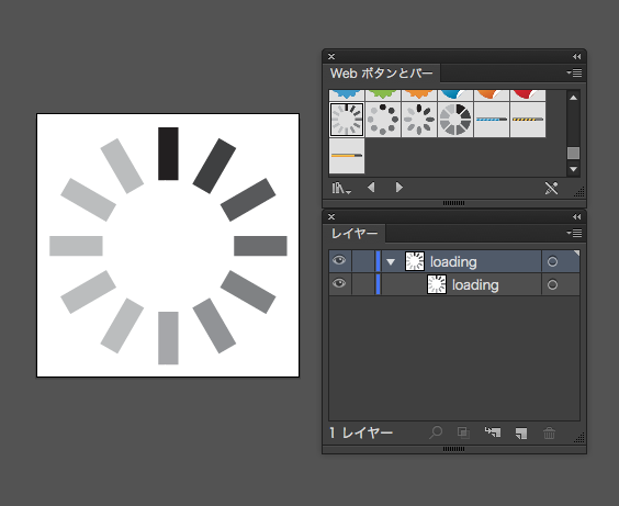
今回は素材として Illustrator の Webボタンとバー のシンボルにちょうど良いのがあったのでそれを利用することにしました。(いつのバージョンからあったんだろう?CC?)
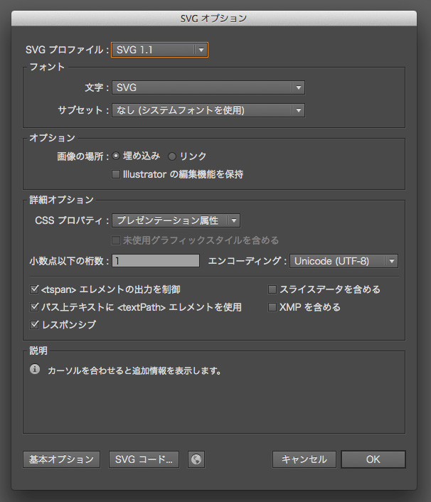
SVG化は「ファイル > 別名で保存 > SVG (svg)」から特に何を変えるわけでもなくそのままです。 書き出してコードを見てから気付いたけど、シンボル化 されてると 書きだされるコードもシンボル化される んですねー、知らんかった。
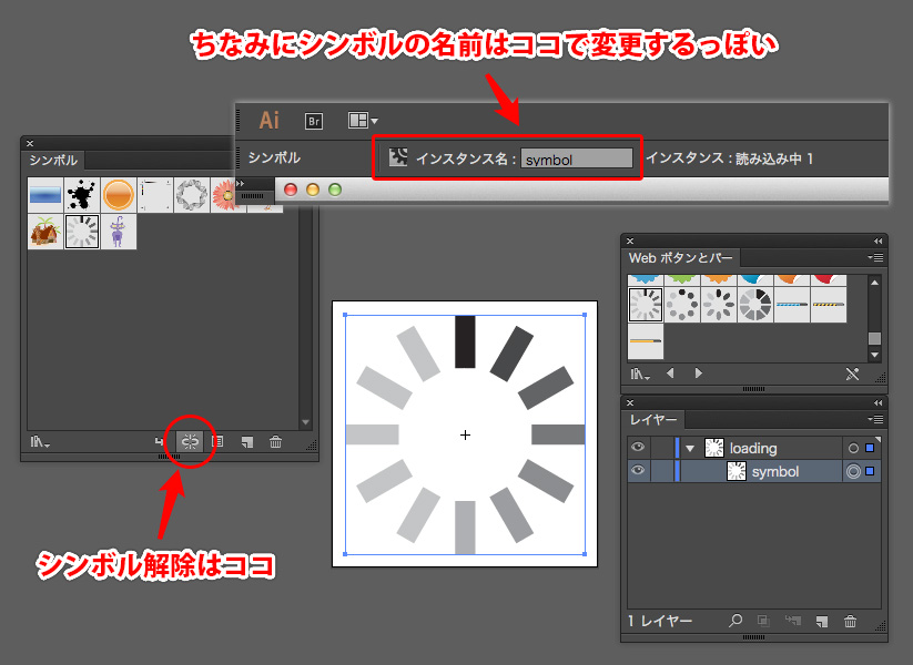
ちなみにシンボル化・シンボルリンクの解除は上の画像のリンクアイコンからできました。
書き出し結果のコードは以下。(リンククリックで展開します)
■ シンボルリンク解除前のSVGコード
<?xml version="1.0" encoding="utf-8"?>
<!-- Generator: Adobe Illustrator 18.1.0, SVG Export Plug-In . SVG Version: 6.00 Build 0)  -->
<svg version="1.1" id="loading" xmlns="http://www.w3.org/2000/svg" xmlns:xlink="http://www.w3.org/1999/xlink" x="0px" y="0px"
	 viewBox="0 0 40 40" enable-background="new 0 0 40 40" xml:space="preserve">
<symbol  id="読み込み中_1" viewBox="-18 -18 36 36">
	<polygon fill="#221E1F" points="1.5,10 -1.5,10 -1.5,18 1.5,18 	"/>
	<polygon fill="#BBBDBE" points="-3.7,9.4 -6.3,7.9 -10.3,14.8 -7.7,16.3 	"/>
	<polygon fill="#BBBDBE" points="-7.9,6.3 -9.4,3.7 -16.3,7.7 -14.8,10.3 	"/>
	<polygon fill="#BBBDBE" points="-10,1.5 -10,-1.5 -18,-1.5 -18,1.5 	"/>
	<polygon fill="#BBBDBE" points="-9.4,-3.7 -7.9,-6.3 -14.8,-10.3 -16.3,-7.7 	"/>
	<polygon fill="#BBBDBE" points="-6.3,-7.9 -3.7,-9.4 -7.7,-16.3 -10.3,-14.8 	"/>
	<polygon fill="#A6A8AB" points="-1.5,-10 1.5,-10 1.5,-18 -1.5,-18 	"/>
	<polygon fill="#929396" points="3.7,-9.4 6.3,-7.9 10.3,-14.8 7.7,-16.3 	"/>
	<polygon fill="#808284" points="7.9,-6.3 9.4,-3.7 16.3,-7.7 14.8,-10.3 	"/>
	<polygon fill="#6D6E70" points="10,-1.5 10,1.5 18,1.5 18,-1.5 	"/>
	<polygon fill="#57595B" points="9.4,3.7 7.9,6.3 14.8,10.3 16.3,7.7 	"/>
	<polygon fill="#404041" points="6.3,7.9 3.7,9.4 7.7,16.3 10.3,14.8 	"/>
</symbol>
<use xlink:href="#読み込み中_1"  width="36" height="36" id="symbol" x="-18" y="-18" transform="matrix(1 0 0 -1 20 20)" overflow="visible"/>
</svg>
シンボルリンクを解除すると gタグ でグループ化される。
■ シンボルリンク解除後のSVGコード
<?xml version="1.0" encoding="utf-8"?>
<!-- Generator: Adobe Illustrator 18.1.0, SVG Export Plug-In . SVG Version: 6.00 Build 0)  -->
<svg version="1.1" id="loading" xmlns="http://www.w3.org/2000/svg" xmlns:xlink="http://www.w3.org/1999/xlink" x="0px" y="0px"
	 viewBox="0 0 40 40" enable-background="new 0 0 40 40" xml:space="preserve">
<g id="symbol">
	<rect x="18.5" y="2" fill="#221E1F" width="3" height="8"/>
	<rect x="11.5" y="3.9" transform="matrix(0.866 -0.5001 0.5001 0.866 -2.1959 7.5559)" fill="#BBBDBE" width="3" height="8"/>
	<rect x="6.4" y="9" transform="matrix(0.4998 -0.8662 0.8662 0.4998 -7.3199 13.3234)" fill="#BBBDBE" width="3" height="8"/>
	<rect x="2" y="18.5" fill="#BBBDBE" width="8" height="3"/>
	<rect x="6.4" y="23" transform="matrix(-0.5001 -0.866 0.866 -0.5001 -11.5678 47.3201)" fill="#BBBDBE" width="3" height="8"/>
	<rect x="11.5" y="28.1" transform="matrix(-0.8659 -0.5002 0.5002 -0.8659 8.1884 66.4433)" fill="#BBBDBE" width="3" height="8"/>
	<rect x="18.5" y="30" fill="#A6A8AB" width="3" height="8"/>
	<rect x="25.5" y="28.1" transform="matrix(-0.8659 0.5003 -0.5003 -0.8659 66.4461 46.435)" fill="#929396" width="3" height="8"/>
	<rect x="30.6" y="23" transform="matrix(-0.4998 0.8662 -0.8662 -0.4998 71.5653 12.6717)" fill="#808284" width="3" height="8"/>
	<rect x="30" y="18.5" fill="#6D6E70" width="8" height="3"/>
	<rect x="30.6" y="9" transform="matrix(0.4998 0.8662 -0.8662 0.4998 27.3297 -21.3206)" fill="#57595B" width="3" height="8"/>
	<rect x="25.5" y="3.9" transform="matrix(0.8662 0.4998 -0.4998 0.8662 7.5496 -12.4398)" fill="#404041" width="3" height="8"/>
</g>
</svg>
今回は便宜上 シンボルリンク解除後のSVGコード を使用します。(結局あとでシンボル化するけど… w)
ちなみにドキュメントのサイズは 40px X 40px です。
02. サンプル01、02の解説
前準備が済んだので、ここから 別ページのサンプル の解説に入ります。
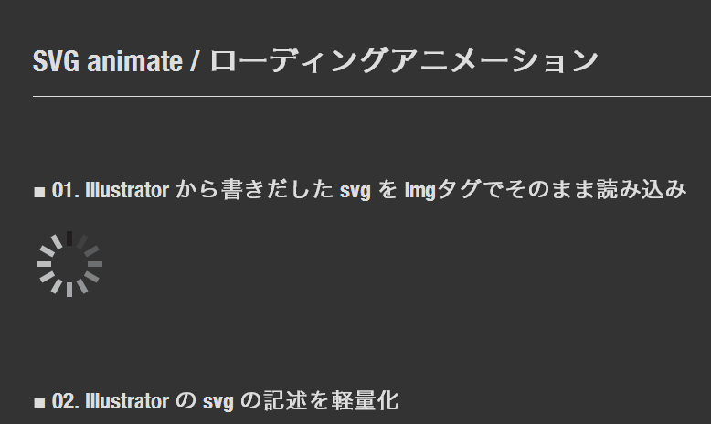
基本的に SVG ファイルは適したブラウザ上であれば通常の画像と同じように imgタグ でリンクを張るだけで利用できます。
■ SVGファイルをimgタグを使って表示
<p><img src="svg/01_loading.svg" class="svg" alt="svgサンプル"></p>
class で表示の大きさを調整してます。SVGファイル本体は 40×40 ですが、そのままだと確認するのに小さかったので 2倍の 80×80 にしています。
■ SVGファイルの表示サイズはcssで調整
.svg {
	width: 80px;
	height: 80px;
}
サンプル02以降は基本的にSVGファイル内の余計な記述を削除したものを使っています。
■ Illustrator の SVG の記述を軽量化
<svg id="loading" xmlns="http://www.w3.org/2000/svg" xmlns:xlink="http://www.w3.org/1999/xlink" viewBox="0 0 40 40" enable-background="new 0 0 40 40">
<g id="symbol">
	<rect x="18.5" y="2" fill="#221E1F" width="3" height="8"/>
	<rect x="11.5" y="3.9" transform="matrix(0.866 -0.5001 0.5001 0.866 -2.1959 7.5559)" fill="#BBBDBE" width="3" height="8"/>
	<rect x="6.4" y="9" transform="matrix(0.4998 -0.8662 0.8662 0.4998 -7.3199 13.3234)" fill="#BBBDBE" width="3" height="8"/>
	<rect x="2" y="18.5" fill="#BBBDBE" width="8" height="3"/>
	<rect x="6.4" y="23" transform="matrix(-0.5001 -0.866 0.866 -0.5001 -11.5678 47.3201)" fill="#BBBDBE" width="3" height="8"/>
	<rect x="11.5" y="28.1" transform="matrix(-0.8659 -0.5002 0.5002 -0.8659 8.1884 66.4433)" fill="#BBBDBE" width="3" height="8"/>
	<rect x="18.5" y="30" fill="#A6A8AB" width="3" height="8"/>
	<rect x="25.5" y="28.1" transform="matrix(-0.8659 0.5003 -0.5003 -0.8659 66.4461 46.435)" fill="#929396" width="3" height="8"/>
	<rect x="30.6" y="23" transform="matrix(-0.4998 0.8662 -0.8662 -0.4998 71.5653 12.6717)" fill="#808284" width="3" height="8"/>
	<rect x="30" y="18.5" fill="#6D6E70" width="8" height="3"/>
	<rect x="30.6" y="9" transform="matrix(0.4998 0.8662 -0.8662 0.4998 27.3297 -21.3206)" fill="#57595B" width="3" height="8"/>
	<rect x="25.5" y="3.9" transform="matrix(0.8662 0.4998 -0.4998 0.8662 7.5496 -12.4398)" fill="#404041" width="3" height="8"/>
</g>
</svg>
SVG対応ブラウザや Illustrator > SVG の記述修正は過去の記事からご参照ください。
サンプル03-01の解説
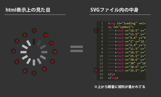
画像を見るとわかりやすいとは思いますが、今回のサンプルは rect で矩形が12個集まったものなので、個別にアクションを加える事ができます。この 03-01 では上から4番目の矩形に対してアニメーション記述をしました。
rect が省略形のタグ閉じをしていたのでそれを通常の閉じタグに変え、その中に animate 記述をします。
■ rect 内に animate を追加
<svg id="loading" xmlns="http://www.w3.org/2000/svg" xmlns:xlink="http://www.w3.org/1999/xlink" viewBox="0 0 40 40" enable-background="new 0 0 40 40">
	<g id="symbol">
		<rect x="18.5" y="2" fill="#221E1F" width="3" height="8" />
		<rect x="11.5" y="3.9" transform="matrix(0.866 -0.5001 0.5001 0.866 -2.1959 7.5559)" fill="#BBBDBE" width="3" height="8"/>
		<rect x="6.4" y="9" transform="matrix(0.4998 -0.8662 0.8662 0.4998 -7.3199 13.3234)" fill="#BBBDBE" width="3" height="8"/>
		<rect x="2" y="18.5" fill="#BBBDBE" width="8" height="3">
			<animate attributeName="x" from="2" to="20" dur="2s" repeatCount="indefinite"/>
		</rect>
		<rect x="6.4" y="23" transform="matrix(-0.5001 -0.866 0.866 -0.5001 -11.5678 47.3201)" fill="#BBBDBE" width="3" height="8"/>
		<rect x="11.5" y="28.1" transform="matrix(-0.8659 -0.5002 0.5002 -0.8659 8.1884 66.4433)" fill="#BBBDBE" width="3" height="8"/>
		<rect x="18.5" y="30" fill="#A6A8AB" width="3" height="8"/>
		<rect x="25.5" y="28.1" transform="matrix(-0.8659 0.5003 -0.5003 -0.8659 66.4461 46.435)" fill="#929396" width="3" height="8"/>
		<rect x="30.6" y="23" transform="matrix(-0.4998 0.8662 -0.8662 -0.4998 71.5653 12.6717)" fill="#808284" width="3" height="8"/>
		<rect x="30" y="18.5" fill="#6D6E70" width="8" height="3"/>
		<rect x="30.6" y="9" transform="matrix(0.4998 0.8662 -0.8662 0.4998 27.3297 -21.3206)" fill="#57595B" width="3" height="8"/>
		<rect x="25.5" y="3.9" transform="matrix(0.8662 0.4998 -0.4998 0.8662 7.5496 -12.4398)" fill="#404041" width="3" height="8"/>
	</g>
</svg>
ちなみにこの animate 記述を翻訳?するとこんな感じ。
属性「x」の値を「2秒」かけて「2」から「20」に変化させ、その動作をずっと繰り返す
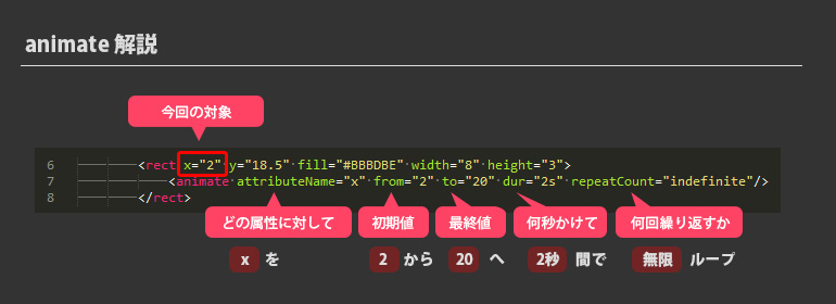
うん、こうして見るとわかりやすいね(^ω^)
次の解説からはこの訳をそれぞれ書いていきます。
サンプル03-02の解説
動作: 属性「x」の値を「2秒」かけて「0」から「20」に変化させ、その動作をずっと繰り返す(シンボル全体に対して)
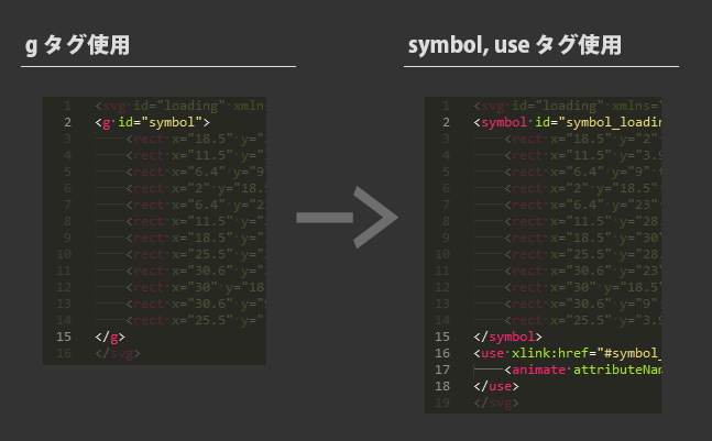
03-01 では一つの矩形に対してのアクションだったけど、今度は全体に対して行ってみたい。そこでさっきの animate の記述を rect 内から g タグ内に移せば出来るのかと思いやってみたけどピクリともしなかった… なんか記述の仕方がおかしいのか、そもそも出来ないのかはすぐには分からなかったので、要素をシンボル化したあとの use 内での記述方法で動かすことにしました。
■ symbol でシンボル化して use で利用
<svg id="loading" xmlns="http://www.w3.org/2000/svg" xmlns:xlink="http://www.w3.org/1999/xlink" x="0px" y="0px" viewBox="0 0 40 40" enable-background="new 0 0 40 40">
<symbol id="symbol_loading">
	<rect x="18.5" y="2" fill="#221E1F" width="3" height="8" />
	<rect x="11.5" y="3.9" transform="matrix(0.866 -0.5001 0.5001 0.866 -2.1959 7.5559)" fill="#BBBDBE" width="3" height="8"/>
	<rect x="6.4" y="9" transform="matrix(0.4998 -0.8662 0.8662 0.4998 -7.3199 13.3234)" fill="#BBBDBE" width="3" height="8"/>
	<rect x="2" y="18.5" fill="#BBBDBE" width="8" height="3"/>
	<rect x="6.4" y="23" transform="matrix(-0.5001 -0.866 0.866 -0.5001 -11.5678 47.3201)" fill="#BBBDBE" width="3" height="8"/>
	<rect x="11.5" y="28.1" transform="matrix(-0.8659 -0.5002 0.5002 -0.8659 8.1884 66.4433)" fill="#BBBDBE" width="3" height="8"/>
	<rect x="18.5" y="30" fill="#A6A8AB" width="3" height="8"/>
	<rect x="25.5" y="28.1" transform="matrix(-0.8659 0.5003 -0.5003 -0.8659 66.4461 46.435)" fill="#929396" width="3" height="8"/>
	<rect x="30.6" y="23" transform="matrix(-0.4998 0.8662 -0.8662 -0.4998 71.5653 12.6717)" fill="#808284" width="3" height="8"/>
	<rect x="30" y="18.5" fill="#6D6E70" width="8" height="3"/>
	<rect x="30.6" y="9" transform="matrix(0.4998 0.8662 -0.8662 0.4998 27.3297 -21.3206)" fill="#57595B" width="3" height="8"/>
	<rect x="25.5" y="3.9" transform="matrix(0.8662 0.4998 -0.4998 0.8662 7.5496 -12.4398)" fill="#404041" width="3" height="8"/>
</symbol>
<use xlink:href="#symbol_loading">
	<animate attributeName="x" from="0" to="20" dur="2s" repeatCount="indefinite"/>
</use>
</svg>
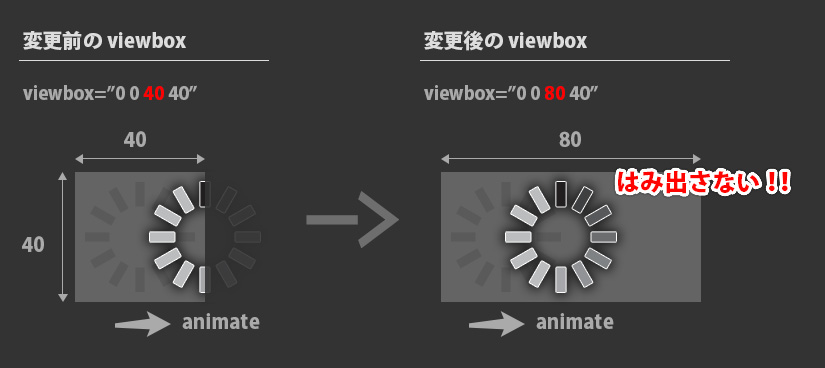
結果は見てもらえば分かるかと思いますが、動きました!でもなんか表示が切れる!!対処法は次の 03-03 で!!!
サンプル03-03の解説
動作: 属性「x」の値を「2秒」かけて「0」から「20」に変化させ、その動作をずっと繰り返す(シンボル全体に対して)
表示が切れる原因は viewbox の表示設定領域が足らなかったのが原因なので、それを広げてあげれば解決!viewbox の値は左から [x] [y] [width] [height] となってます。
※html で表示する際に css で大きさ調整をしているので、そこも合わせて変更してあげる必要があります。
■ SVG 内の viewBox の値を変更
<svg id="loading" xmlns="http://www.w3.org/2000/svg" xmlns:xlink="http://www.w3.org/1999/xlink" x="0px" y="0px" viewBox="0 0 80 40" enable-background="new 0 0 40 40">
■ html で class名を変更(新規追加)
<p><img src="svg/03_loading_move03.svg" class="svg-w80" alt="svg-moveA03サンプル"></p>
■ css で表示サイズ調整
.svg-w80 {
	width: 160px;
	height: 80px;
}
一つ、サンプルで enable-background の値を変更し忘れてました… orz 今回は特に問題にはなりませんでしたが、ここも値を設定しているのであれば viewbox と同じように修正しといた方が良さそうですね。
背景画像に対して何かをするプロパティらしいですが、まだちゃんと試したことないので今は詳細はわかりません!
サンプル04-01の解説
動作: 以下を繰り返す
- 属性「x」の値を「2秒」かけて「0」から「20」に変化
- 属性「x」の値を「1秒」かけて「20」から「20」に変化(ポーズ処理)
- 属性「x」の値を「2秒」かけて「20」から「0」に変化
- 属性「x」の値を「1秒」かけて「0」から「0」に変化(ポーズ処理)
animate を複数使って4つのアクションを設定してます。
begin の「pause2.end」とかで animate に設定した id の終わりのタイミングを取得して、指定 id のアクション終わりで次のアクションを実行!という風にしてます。
■ 複数の animate の設定
<use xlink:href="#symbol_loading">
	<animate id="move1" attributeName="x" attributeType="XML" begin="0s;pause2.end" dur="2s" from="0" to="20" />
	<animate id="pause1" attributeName="x" attributeType="XML" begin="move1.end" dur="1s" from="20" to="20" />
	<animate id="move2" attributeName="x" attributeType="XML" begin="pause1.end" dur="2s" from="20" to="0" />
	<animate id="pause2" attributeName="x" attributeType="XML" begin="move2.end" dur="1s" from="0" to="0" />
</use>
サンプル04-02の解説
動作: 04-01 と同じで、動きに緩急(ease-out)を付与
calcMode と keySplines を使って動き方を ease-out にしてます。止まる前の動作がゆっくりになってますね。
■ calcMode、keySplines で ease-out
<use xlink:href="#symbol_loading">
	<animate id="move1" keyTimes="0;1" attributeName="x" attributeType="XML" begin="0s;pause2.end" dur="2s" from="0" to="20" calcMode="spline" keySplines="0.0 0.0 0.58 1.0" />
	<animate id="pause1" keyTimes="0;1" attributeName="x" attributeType="XML" begin="move1.end" dur="1s" from="20" to="20" />
	<animate id="move2" keyTimes="0;1" attributeName="x" attributeType="XML" begin="pause1.end" dur="2s" from="20" to="0" calcMode="spline" keySplines="0.0 0.0 0.58 1.0" />
	<animate id="pause2" keyTimes="0;1" attributeName="x" attributeType="XML" begin="move2.end" dur="1s" from="0" to="0" />
</use>
ココらへんのイージング設定は下の参考サイトのお世話になりました!

サンプル04-03の解説
動作: 04-01 と同じで、動きに緩急(ease-in-out)を付与
動き始め・終わりがゆっくり動作します。
■ calcMode、keySplines で ease-in-out
<use xlink:href="#symbol_loading">
	<animate id="move1" keyTimes="0;1" attributeName="x" attributeType="XML" begin="0s;pause2.end" dur="2s" from="0" to="20" calcMode="spline" keySplines="0.42 0.0 0.58 1.0" />
	<animate id="pause1" keyTimes="0;1" attributeName="x" attributeType="XML" begin="move1.end" dur="1s" from="20" to="20" />
	<animate id="move2" keyTimes="0;1" attributeName="x" attributeType="XML" begin="pause1.end" dur="2s" from="20" to="0" calcMode="spline" keySplines="0.42 0.0 0.58 1.0" />
	<animate id="pause2" keyTimes="0;1" attributeName="x" attributeType="XML" begin="move2.end" dur="1s" from="0" to="0" />
</use>
サンプル05-01の解説
動作: 属性「x」の値を「2秒」かけて「0」から「20」に変化させ、その動作をずっと繰り返す(03-03と同じ動き)
今までの animate は from:開始値、to:終了値 を設定してきましたが、今度は keyTimes と values でアクションを設定しています。
■ from,to の代わりに keyTimes,values を用いたサンプル
<use xlink:href="#symbol_loading">
	<animate keyTimes="0; 1" values="0; 20" attributeName="x" attributeType="XML" begin="0s" dur="2s" repeatCount="indefinite" />
</use>
keyTimes は 0~1 までの間を「;」(セミコロン)で区切ってアクションを増やせるみたいですね。values は keyTimes と同じ数設定する必要がある。
keyTimes と values の設定でもう少し遊んでみたいと思います。
サンプル05-02の解説
動作: 属性「x」の値を「2秒」かけて「0 (0秒時)」→「20 (1秒時)」→「0 (2秒時)」に変化させ、その動作をずっと繰り返す
05-01 に動作を一つ加えたパターン。終了値が開始値と同じなので反復してるように見えます。
■ 休みなしの反復動作
<use xlink:href="#symbol_loading">
	<animate keyTimes="0; .5; 1" values="0; 20; 0" attributeName="x" attributeType="XML" begin="0s" dur="2s" repeatCount="indefinite" />
</use>
サンプル05-03の解説
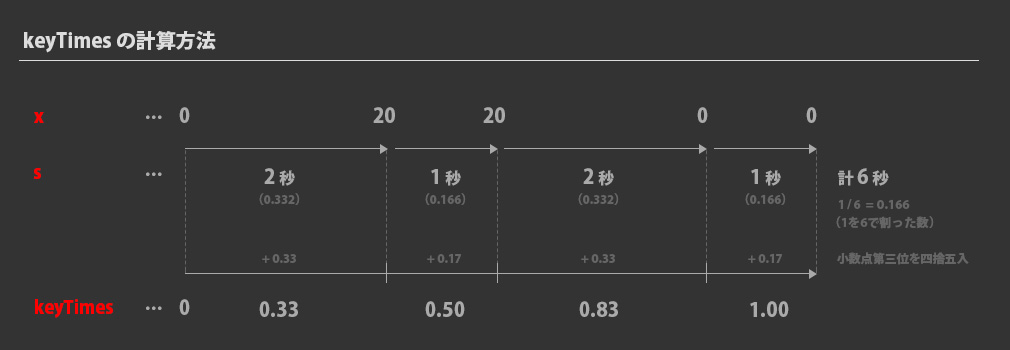
動作: 属性「x」の値を「6秒」かけて「0 (0秒時)」→「20 (2秒時)」→「20 (3秒時)」→「0 (5秒時)」→「0 (6秒時)」に変化させ、その動作をずっと繰り返す(04-01とほぼ同じ動き)
keyTimes と values で複数の動作を詰め込もうとするとちょっと計算が必要になってくる。keyTimes には 0~1 の間でタイミング調整する必要があるので、1つずつのアクションが 全体を6秒 とした時にいくつになるのかを割り出さないといけない。
from – to より文字数は圧倒的に少なく済むけど、計算の手間を考えると from – to の方が楽かなーと。もしちゃんと使うんであれば専用に簡単な計算ツール作っちゃうといいかもです。
■ 休みなしの反復動作
<use xlink:href="#symbol_loading">
	<animate keyTimes="0; .33; .50; .83; 1" values="0; 20; 20; 0; 0" attributeName="x" attributeType="XML" begin="0s" dur="6s" repeatCount="indefinite" />
</use>
サンプル05-04の解説
動作: 05-03 と同じで、動きに緩急(ease-in-out)を付与(04-03とほぼ同じ動き)
keyTimes と values はさっきの 05-03 のままで、calcMode と keySplines を付けて ease-in-out してます。values の間の数分 keySplines の値を設定する必要があるみたいです。
■ keyTimes, values + ease-in-out
<use xlink:href="#symbol_loading">
	<animate
		 keyTimes="0; .33; .50; .83; 1"
		 values="0; 20; 20; 0; 0"
		 attributeName="x"
		 attributeType="XML"
		 begin="0s"
		 dur="6s"
		 repeatCount="indefinite"
		 calcMode="spline"
		 keySplines="0.42 0.0 0.58 1.0; 0 0 1 1; 0.42 0.0 0.58 1.0; 0 0 1 1" />
</use>
サンプル06-01の解説
動作: 1.6秒かけて一回転する動作を繰り返す
今度は回転をさせるために animateTransform を使います。いよいよ普段よく見るようなローディングアニメーションにしていこうかと!
type を rotate にして from と to に値を入れていきます。設定できる値は [角度] [x 軸の中心点] [y 軸の中心点] となってるのかな? 今回は中心点を領域の中心にしたいので 20, 20 にしています。
■ animateTransform – rotate01
<use xlink:href="#symbol_loading">
	<animateTransform
		 attributeName="transform"
		 type="rotate"
		 begin="0s"
		 dur="1.6s"
		 from="0,20,20"
		 to="360,20,20"
		 repeatCount="indefinite" />
</use>
でもこれだと回転が滑らかすぎて思い描くローディングとは違うので次で調整してみます。
サンプル06-02の解説
動作: 30度角度回転x12回 を 0.612秒かけて一回とする動作を繰り返す
04-01 と同じように 動かす処理と動かさない処理を交互に実行してお馴染みのローディングアニメーションにしています。でも書き方がなんかスマートじゃないな… これなら rect に対して直接指定する方法の方がいいのかな?
■ animateTransform – rotate02
<use xlink:href="#symbol_loading">
	<animateTransform id="rot1" attributeName="transform" type="rotate" begin="0s;pause12.end" dur="0.001s" from="0,20,20" to="30,20,20" />
	<animateTransform id="rot2" attributeName="transform" type="rotate" begin="pause1.end" dur="0.001s" from="30,20,20" to="60,20,20" />
	<animateTransform id="rot3" attributeName="transform" type="rotate" begin="pause2.end" dur="0.001s" from="60,20,20" to="90,20,20" />
	<animateTransform id="rot4" attributeName="transform" type="rotate" begin="pause3.end" dur="0.001s" from="90,20,20" to="120,20,20" />
	<animateTransform id="rot5" attributeName="transform" type="rotate" begin="pause4.end" dur="0.001s" from="120,20,20" to="150,20,20" />
	<animateTransform id="rot6" attributeName="transform" type="rotate" begin="pause5.end" dur="0.001s" from="150,20,20" to="180,20,20" />
	<animateTransform id="rot7" attributeName="transform" type="rotate" begin="pause6.end" dur="0.001s" from="180,20,20" to="210,20,20" />
	<animateTransform id="rot8" attributeName="transform" type="rotate" begin="pause7.end" dur="0.001s" from="210,20,20" to="240,20,20" />
	<animateTransform id="rot9" attributeName="transform" type="rotate" begin="pause8.end" dur="0.001s" from="240,20,20" to="270,20,20" />
	<animateTransform id="rot10" attributeName="transform" type="rotate" begin="pause9.end" dur="0.001s" from="270,20,20" to="300,20,20" />
	<animateTransform id="rot11" attributeName="transform" type="rotate" begin="pause10.end" dur="0.001s" from="300,20,20" to="330,20,20" />
	<animateTransform id="rot12" attributeName="transform" type="rotate" begin="pause11.end" dur="0.001s" from="330,20,20" to="360,20,20" />

	<animateTransform id="pause1" attributeName="transform" type="rotate" begin="rot1.end" dur="0.05s" from="30,20,20" to="30,20,20" />
	<animateTransform id="pause2" attributeName="transform" type="rotate" begin="rot2.end" dur="0.05s" from="60,20,20" to="60,20,20" />
	<animateTransform id="pause3" attributeName="transform" type="rotate" begin="rot3.end" dur="0.05s" from="90,20,20" to="90,20,20" />
	<animateTransform id="pause4" attributeName="transform" type="rotate" begin="rot4.end" dur="0.05s" from="120,20,20" to="120,20,20" />
	<animateTransform id="pause5" attributeName="transform" type="rotate" begin="rot5.end" dur="0.05s" from="150,20,20" to="150,20,20" />
	<animateTransform id="pause6" attributeName="transform" type="rotate" begin="rot6.end" dur="0.05s" from="180,20,20" to="180,20,20" />
	<animateTransform id="pause7" attributeName="transform" type="rotate" begin="rot7.end" dur="0.05s" from="210,20,20" to="210,20,20" />
	<animateTransform id="pause8" attributeName="transform" type="rotate" begin="rot8.end" dur="0.05s" from="240,20,20" to="240,20,20" />
	<animateTransform id="pause9" attributeName="transform" type="rotate" begin="rot9.end" dur="0.05s" from="270,20,20" to="270,20,20" />
	<animateTransform id="pause10" attributeName="transform" type="rotate" begin="rot10.end" dur="0.05s" from="300,20,20" to="300,20,20" />
	<animateTransform id="pause11" attributeName="transform" type="rotate" begin="rot11.end" dur="0.05s" from="330,20,20" to="330,20,20" />
	<animateTransform id="pause12" attributeName="transform" type="rotate" begin="rot12.end" dur="0.05s" from="360,20,20" to="360,20,20" />
</use>
サンプル06-03の解説
動作: 30度角度回転x12回 を 0.6秒かけて一回とする動作を繰り返す
06-02 の記述を減らすために from, to から keyTimes, values に変えてみました。コードは見やすくするためにあえて改行多めにしてます。 calcMode="discrete" にすることでアニメーション間の補完をしなくなるので、これで滑らかさを消してます。
■ animateTransform – rotate03
<use xlink:href="#symbol_loading">
	<animateTransform
		 attributeName="transform"
		 type="rotate"
		 begin="0s"
		 dur="0.6s"
		 keyTimes="
			 0;
			 .08;
			 .16;
			 .24;
			 .32;
			 .4;
			 .48;
			 .56;
			 .64;
			 .72;
			 .8;
			 .88;
			 1"
		 calcMode="discrete"
		 values="
			 0 20 20;
			 30 20 20;
			 60 20 20;
			 90 20 20;
			 120 20 20;
			 150 20 20;
			 180 20 20;
			 210 20 20;
			 240 20 20;
			 270 20 20;
			 300 20 20;
			 330 20 20;
			 360 20 20"
		 repeatCount="indefinite" />
</use>
まだ記述の仕方を変えたバージョンは思いつきますが、これ以上はキリ無くなってしまいそうだし一応思い描いた動作は出来たので今回は一先ずここまで!!
SVG animate を色々試して思ったこと
最後 animateTransform も使いましたが、記述の仕方って結構色々あるんだなーと知りました。その結果、個人的にですが無理に SVG 内でアニメーションをまとめようとしなくても良いかなーと思いました。
もちろんやろうとしてることが SVG 内記述で実現できてそれが最善の道であれば管理も楽だしそれがベストです。だけどもし css や JS を使って実現させた方が楽っていうのであればそれでもいいのかなーと。総合的に考えて手間かけなくて良いパフォーマンス発揮出来れば無理に一つの方法にこだわる必要もないでしょう。
でも SVG 内で魅力的なアニメーションをしてるサンプルがネット上に無数にあるので日々研究は続けていこうと思います!以上(・∀・)